A redesign of Librus – Poland's most-used and least-loved school app
Does a school app really have to be this frustrating?
There are products we use because we choose them. And there are products we use because we have no real alternative.
For many parents in Poland, a school e-register belongs to the second group.
As a parent, I use Librus almost every day to stay oriented in school life: messages from school, changes in the lesson plan, absences to explain, important announcements and signals about my child's progress. In theory, this should make school-related communication easier to follow. In practice, it often feels like a product built around functions, with the person trying to use it left somewhere on the side.
Too many non-essential elements. Too much friction before reaching the information that matters. Navigation that feels heavier than it needs to be. Official, technical language where a parent needs clarity. Advertising and paid features in a product that already sits in a sensitive context: a child's education.
As UX/UI designers, we framed this as a focused design exercise around one question: what would happen if the parent account was designed around the parent's real daily needs?
A scoped redesign of the parent experience
This was a scoped redesign focused on the parent experience. The whole ecosystem, every role, every business rule and every school process stayed outside our scope.
We focused on a few moments that create the most everyday friction: the start view, navigation, the grades view, and the subject view. These are the screens parents return to again and again, often quickly, between work, school logistics and everyday responsibilities.
That is also why the redesign did not need to be radical. In a product like this, the biggest improvement often comes from removing noise, grouping information better and making the next useful action more obvious.
The start view should answer the parent's first question
The current experience often makes the user search for context before they can act. A parent opens the app and still has to work out what matters today.
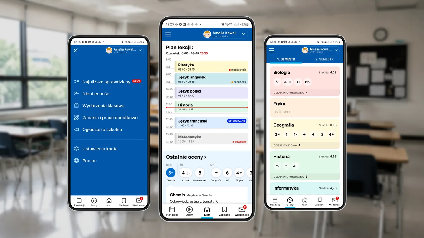
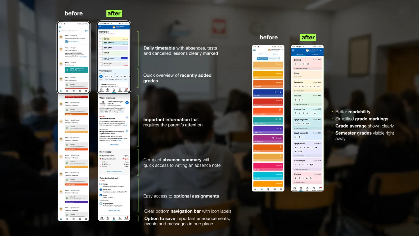
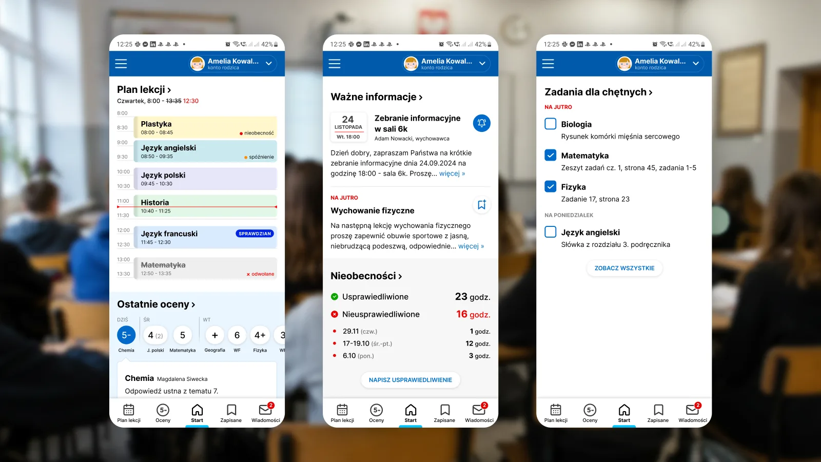
We redesigned the start view as a compact daily overview. The idea was simple: the parent should see the most important school-related information without digging through multiple places. The lesson plan for the day, absences, tests, cancelled lessons, recently added grades, important messages and tasks that require attention should not compete with secondary content.
The redesigned home screen gives priority to what helps the parent understand the current situation: today's lesson plan with absences, tests and cancelled classes; quick access to recently added grades; important information that requires attention; absence summary with a shortcut to write an excuse; easy access to optional tasks; and a clearer bottom navigation bar with labelled icons.
The goal was to make the screen compact, readable and useful at first glance, while keeping all the necessary information available.
Navigation should match how parents think
One of the biggest problems with many institutional products is that navigation mirrors the internal structure of the system, while the user's mental model stays separate.
Librus is a good example of this. The menu contains a long list of functions and views, with very different levels of importance in everyday use. When a menu grows to more than twenty positions, it stops helping the user and starts becoming another task.
We simplified the navigation by grouping existing views into fewer, more meaningful categories and adding a persistent bottom bar for the most frequent actions.
This is a small change with a big impact. Parents do not open the app to explore its structure. They open it to answer practical questions: What is happening today? Is there something I should notice? Was there a change in the lesson plan? Is there a message from school? Does an absence need to be explained?
Navigation should support those questions directly. The parent should not have to translate them into the system's internal categories.
Grades need clarity above all
Grades are a sensitive part of the school experience. Whether we like the grading system or not, parents still need to understand what is happening.
The current grades view can be difficult to scan quickly, especially when the user wants to understand the individual mark and its context: category, average, semester grade or proposed final grade.
In our redesign, we focused on making the view easier to read and interpret. We simplified grade labels, improved visual hierarchy and made key information visible without forcing the parent to open additional views. The parent can see the average, semester information and grade categories more clearly, while still keeping the view compact.
This matters because good UX in an education product is about more than speed. It is about reducing unnecessary stress. A parent should not have to decode the interface before understanding the situation.
A subject view should contain the full context
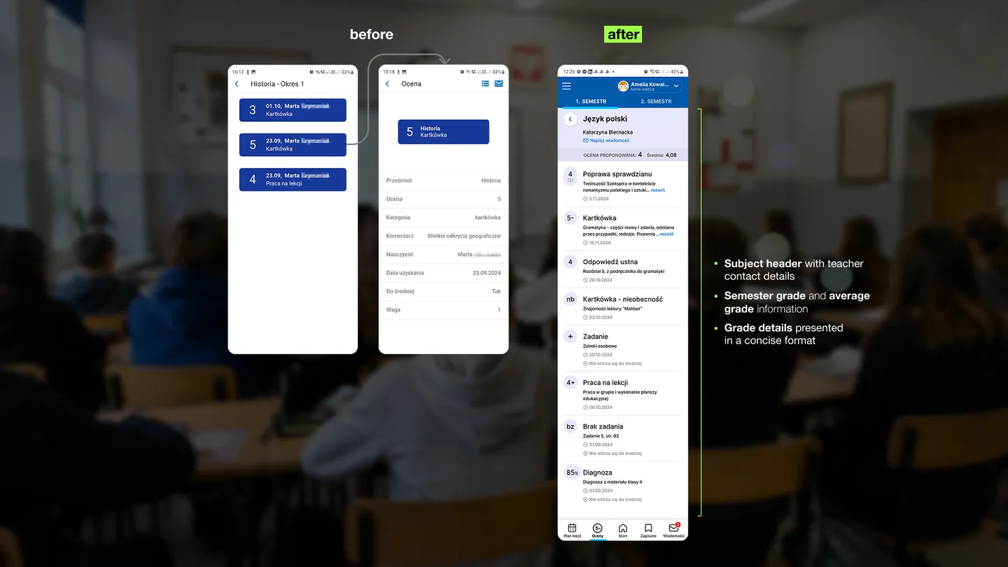
The subject view is another place where the current experience can create unnecessary steps. If a parent enters a subject, they should immediately understand the most important details related to that subject.
We redesigned the subject view to bring the context together: the subject header, teacher contact, semester grade, average and concise details about individual grades.
This reduces the need to move through separate screens just to build a basic picture of what is happening in one subject. The view becomes more informative while staying compact.
The principle was the same as in the start view: bring related information closer together, remove unnecessary navigation and give the parent enough context to act.
The same problem appears across the category
Librus is an obvious example because so many parents use it. The problem is larger.
From conversations with other parents, we know that users of competing e-registers often struggle with similar issues: clutter, confusing navigation, inconsistent priorities, language that feels more administrative than human, and interfaces that seem to serve the system before they serve the user.
This is especially frustrating because school software sits very close to everyday life. It affects parents, children, teachers and school staff. It carries information that can create stress, require action or influence communication between home and school.
That makes usability a basic responsibility.
What this exercise shows
Our redesign was intentionally limited. We did not need months of work to show that the parent experience could be clearer.
A more useful start view. A shorter navigation structure. A grades view that explains the situation clearly. A subject view that keeps the relevant context in one place.
These are everyday product decisions that should be standard in tools used by millions of people.
And that is the point.
A digital product does not have to be exciting to deserve good design. Some of the most important products are the ones we have no choice about. Those products should respect the user's time, attention and emotional load even more.
The real question is something else.
Why are so many essential digital services still allowed to feel this hard to use?